Struggling to choose towel colors that sell? The wrong shades can hurt your brand’s image and leave you with unsold stock. Let’s find the perfect palette for your customers.
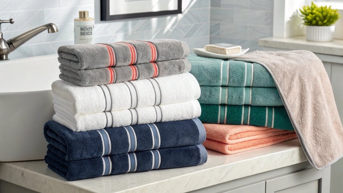
The best bath towel color combinations align with your brand identity and target market. Classic choices include monochromatic schemes (shades of grey), analogous colors (blue and green), or contrasting colors (navy and coral). Consider your customer’s bathroom decor trends for maximum appeal.
Choosing colors feels subjective, but there’s a science to it, especially in manufacturing. A color decision impacts everything from brand perception to production costs and inventory management. Since starting TowelTrend in 2004, I’ve seen brands build empires on a single, signature color, while others struggled with a random, disconnected assortment. Getting your color strategy right from the start is crucial for success. Let’s break down how to make confident, profitable decisions for your towel line.
What color should your bath towels be?
Overwhelmed by endless color options? Picking the wrong one can mean slow sales and a wasted investment. I’ll guide you to a color that truly resonates with your brand and customers.
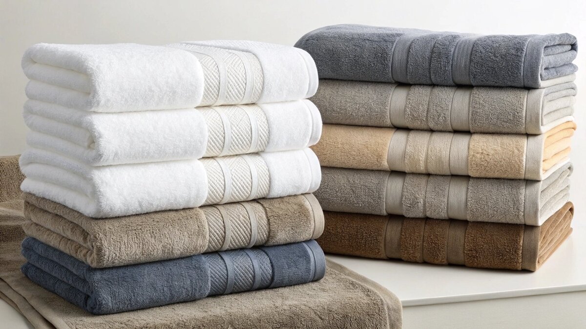
Your bath towels should be a color that reflects your brand’s personality and appeals to your target audience. Neutral colors like white, grey, and beige are safe, timeless choices. Bolder colors can create a strong brand statement but require more market research.
The "right" color is a balance between your brand’s story and what your customer wants. I always advise new clients to think about their brand’s core message first. Are you a luxury brand promising a spa-like escape? Deep, sophisticated tones like charcoal, navy, or even a rich espresso might work. Are you an eco-conscious brand? Earthy greens, sandy beiges, and muted clay colors will connect with your audience. As a manufacturer, I can tell you that translating that vision into fabric is a precise process. We use the Pantone Matching System (PMS) to ensure the exact shade you envision is the shade we produce. This removes guesswork and guarantees color consistency across every order, which is vital as you scale your brand.
Tying Color to Brand Identity
Your color choice is a silent brand ambassador. It’s the first thing a customer notices. A bright, playful brand might opt for coral or teal towels to stand out. A minimalist home goods company will reinforce its aesthetic with a palette of light grey, oatmeal, and crisp white. The key is consistency. When we work with a brand on a custom color, we create a "lab dip"—a small swatch of dyed fabric—for approval. We keep a record of this approved color, so when you place a reorder six months later, the new batch is an exact match to the first. This level of precision protects your brand identity.
The Practicalities of Dyeing
Here’s a look at how different color strategies impact production:
| Color Strategy | Best For Brands That Are… | Manufacturing Consideration |
|---|---|---|
| Neutral Palette | Minimalist, Luxury, Spa-focused | Easiest to color match for reorders. Lower risk and often seen as a premium, timeless choice. |
| Bold & Trendy | Young, Fashion-forward, Digital-first | Requires precise Pantone matching to nail the color. We can do this, but it’s crucial to approve lab dips first. |
| Earthy Tones | Eco-conscious, Natural, Wellness | Often uses specific eco-friendly dyes. We ensure high colorfastness so the color won’t fade with washing. |
Should all your bath towels be the same color?
Wondering if a single color is boring? But offering too many colors can complicate inventory and confuse buyers. Let’s find the sweet spot for your brand’s towel collection.
No, your bath towels don’t all have to be the same color. Offering a curated collection of three to five complementary colors is a smart strategy. It provides choice without overwhelming the customer and allows for creative mixing and matching.
Offering a small, curated palette is one of the most effective strategies I’ve seen. It works because it simplifies the customer’s choice while still giving them options for personalization. More importantly for you, the brand owner, it makes inventory management much easier. Instead of gambling on a dozen different SKUs, you can focus on a few proven sellers. This is especially helpful for new brands testing the market with our low 500-piece MOQ. You can split that order across a few colors to see what sells best before committing to a larger volume. This data-driven approach minimizes risk and maximizes your return on investment.
The Case for a Monochromatic Collection
Focusing on a single color family (e.g., light grey, medium grey, charcoal) can be incredibly powerful. It creates a strong, recognizable brand identity. I remember a client who built their entire home-textile business around a specific shade of French blue. It was elegant, simple, and instantly identifiable. From a production standpoint, it’s also efficient. We are dyeing fabric in similar color families, which can streamline the process. For your business, it simplifies photography, marketing, and inventory. You never have to worry about a color clashing; everything just works together.
The Power of a Curated Palette
A multi-color collection is about smart curation, not endless options. I often advise clients to build a palette with three roles:
- The Neutral Base: A white, cream, or light grey that anchors the collection.
- The Core Color: The main brand color that makes a statement.
- The Accent Color: A complementary or seasonal shade that adds a pop of interest.
This structure encourages customers to buy multiple sets to mix and match. It also gives you flexibility. You can introduce a new accent color each season without having to redesign your entire line. This keeps your brand fresh and encourages repeat purchases.
How to mix and match bath towels?
Want to offer stylish towel sets that customers love? Clashing colors can look unprofessional and may not sell. I’ll show you proven methods to create combinations that look great.
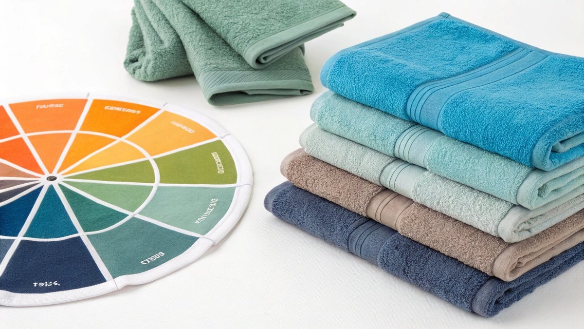
Mix and match towels easily by using a color wheel. You can combine analogous colors (those next to each other, like blue and green), complementary colors (opposite each other, like orange and blue), or a monochromatic scheme (different shades of one color, like light grey and charcoal).
Teaching your customers how to mix and match towels is a brilliant marketing move. It positions your brand as a style authority and encourages larger purchases. Instead of just selling a towel, you’re selling a look. The key is to base your combinations on simple, classic design principles. Don’t just throw colors together; create intentional palettes that feel harmonious and sophisticated. When you present these combinations on your website or social media, you make it easy for customers to visualize them in their own homes. This removes the guesswork and gives them the confidence to buy a full set.
Classic Color Combination Rules
You don’t need to be a designer to create beautiful palettes. Just follow these simple rules:
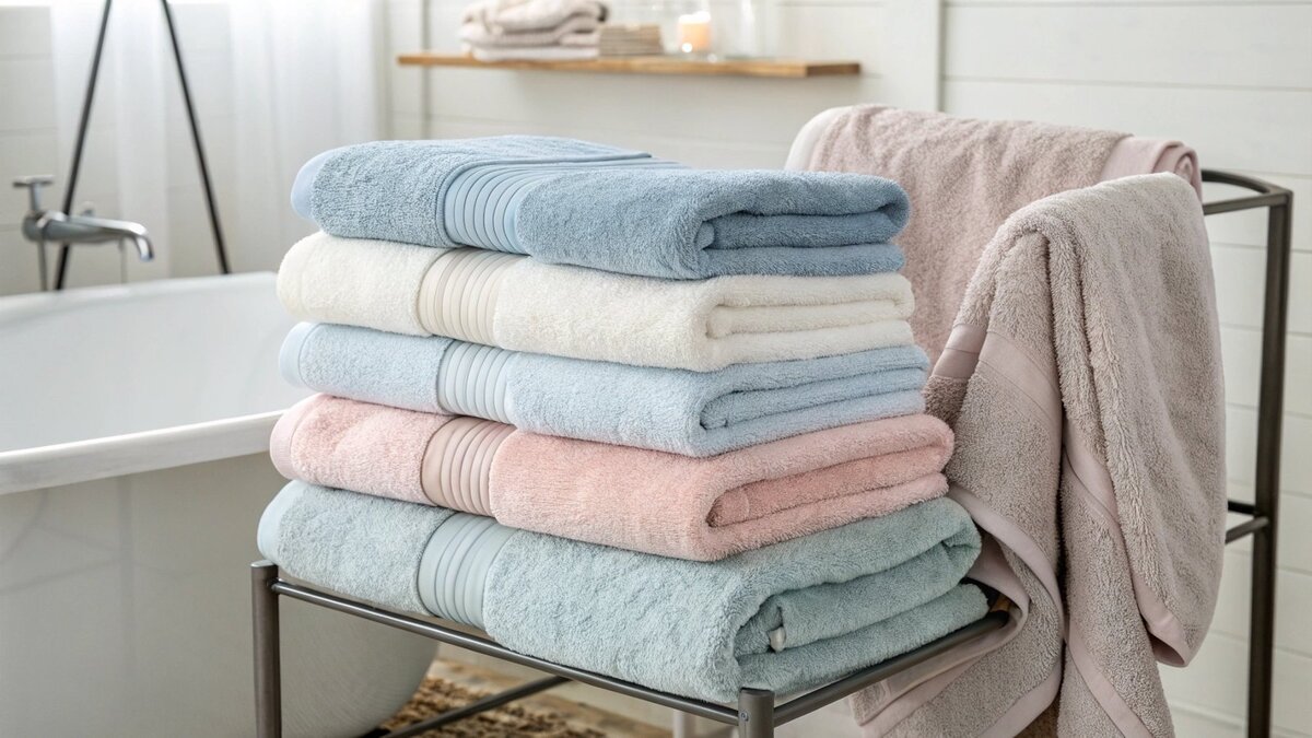
- Monochromatic: This is the easiest and often most sophisticated approach. Pair a light blue hand towel with a navy blue bath towel. The shared color ties them together effortlessly.
- Analogous: Choose colors that are neighbors on the color wheel. Think of a calming coastal vibe with a palette of sand, seafoam green, and soft blue. It’s harmonious and pleasing to the eye.
- Complementary: For a bold, high-energy look, choose colors from opposite sides of the color wheel. A deep navy paired with a burnt orange accent can be stunning. This is great for brands with a confident, modern edge.
A Manufacturer’s Tip for Perfect Palettes
Here’s a piece of advice I give every client: always approve physical lab dips of your chosen colors together. A computer screen can’t accurately show how two fabric colors will interact in real life, especially under the warm lighting of a typical bathroom. At TowelTrend, we can produce lab dip samples for your entire color palette and send them to you for approval. You can hold them in your hand, see them in different lights, and be 100% certain that your "light grey" and "charcoal" create the exact sophisticated look you’re aiming for before we start your 500-piece production run. This simple step prevents costly surprises down the road.
Should bath towels always be white?
Thinking white towels are the only "premium" option? While they are classic, they also show stains easily and might not fit your brand’s unique identity. Let’s explore if white is right for you.
No, bath towels should not always be white. While white is popular in hotels for its clean look and ease of bleaching, colored towels can hide stains better, create a cozier atmosphere, and are a powerful way to express a unique brand identity.
The "white towel myth" comes from the hotel industry. For hotels, white makes sense. They can bleach everything together, and it signals a standard of hygiene. But for a direct-to-consumer brand, the rules are different. Your customers aren’t bleaching towels after every use. They are living with them. They are dealing with makeup stains, hair dye, and daily grime. For many, a colored towel is simply more practical. It’s also an opportunity for you to stand out in a sea of sameness. A unique color can be your brand’s most powerful asset.
The Enduring Appeal of White Towels
There is a strong case for white towels. They communicate luxury, cleanliness, and simplicity. They are timeless and will never go out of style. From a manufacturing perspective, white towels can sometimes be produced faster and with a lower MOQ. This is because the greige goods (the raw, undyed towels) don’t have to go through a custom dyeing process. For brands looking for the absolute quickest turnaround or launching a hotel supply line, white is a solid, reliable choice. We always have high-quality white towels ready for branding and quick shipment.
When Color is the Smarter Choice
However, colored towels offer distinct advantages. I worked with a brand that targeted young families. They launched with a line of dark grey and navy towels. Their marketing message was simple: "Life is messy. Your towels don’t have to show it." They were a huge success because they solved a real problem for their customers. Color also allows for personalization. Many people have neutral, white, or grey bathrooms and want towels to add a pop of color and personality. By offering a beautiful shade of emerald green or dusty rose, you give them a simple way to update their space without renovating. Color helps you tell a story and connect with your customer on an emotional level.
Conclusion
Choosing the right towel colors balances brand identity, market trends, and manufacturing realities. A well-planned palette will boost sales, strengthen your brand, and ensure a smooth production process.

